begin at the beginning
- Tania Staras
- 1 hour ago
- 4 min read


As part of my OCA course I undertook a virtual ‘drift’, led by maps. My first thought was to take one of the areas in Lancashire that I want to explore but don’t know well. I considered Bury and wondered if it would be interesting to “walk” the area in the shape of a letter; maybe even “B” for Bury. I had a desultory play around, but it just wasn’t grabbing me.
I then decided that Google maps felt too constrained – their style of mapping, which we use every day, is about decisions and choices. We tend to think that it represents the world as it is because we make such heavy use of it. In my early driving days, I relied on big unwieldy AA road atlases with Ordnance Survey 1:250000 for walking and AtoZs for towns and cities. At the time I thought they were an honest and objective schema of my world (if I thought about them at all). However, Ordnance survey maps include places known by that name only by the one person they happened to speak to. Other names get lost or mutate as map edition follows map edition. Google also makes decisions about what to include and what to leave out – roads and tracks not traveled or the poor resolution and heavy pixilation in areas deemed not interesting or important. Mapping has always been an exercise in control and power – what to put in, what to leave out. Swathes of the world were “named” by white colonists, who believed that their nomenclature conferred true existence on a mountain or cove that otherwise had only a (or several) local name(s).
So mapping is complex and layered and I feel I always need to remember that maps give us a story not the objective truth – they are as much a piece of art as a painting or sketch.
I also reminded myself that as well as being an artist, I am an historian. So I went back to the National library for Scotland and have done a derive of a section of Accrington through time.
The exercise has been a fascinating one. It has shown me what is temporary (even if it seemed permanent at the time) and what lingers. I chose an area of Accrington in Lancs generally described as ‘New Accrington’. My first map (from the 1850s) showed the pre-eminence of the railway (opened in 1848). There is also a building on the east side of the railways just shown as a black blob but which in subsequent maps is revealed to be a mill. The contour lines give a real sense of the shape of the environment. In the middle is a tiny black shape – a farm house…?
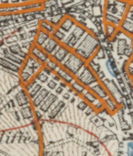
By 1870 the contour lines are now much more as we are used to seeing them in modern mapping, but somehow diminish the drama of the landscape. The railways still boundary the area. The old town in the east has an organic medieval layout - but also has school, church, chapel, post of ce and gasometers. Something 'modern' is taking shape. New Accrington is still rural but I can feel the town creeping closer - a cotton factory has appeared by the reservoir and there are a handful of block like buildings, as yet unnamed, in the centre of the picture. The tiny black farmhouse in the previous map now has a name -"Priest Heys". Even if I hadn't seen the next map, I would feel that this was a town that was teetering on some kind of brink. it feels poised, like a person with their toes round the end of a diving board.
New Accrington 1890s The speed and scope of change takes your breath away. The countryside has vanished under rows of terraces, creeping into the margins of the space. In the centre the big rectangular buildings ll their spaces to the point where they don't even have edges. And they are named - The Globe Works. Textile engineers and the biggest employers in the town. The old house - Priest Heys - still exists, bolted onto the end of a row of terraces and sandwiched up against the Globe works. The country barricaded by the town, everything marching to the beat of the factory clock and horn. The noise, the smell, and everywhere the colour leeched to grey by the smoke of coal fired machines and coal warmed houses. I feel as though I can taste the acrid air.
Accrington in the twentieth century These two maps date from the 1940's and 1960's. They have a designer quality, prizing neatness and order over messy reality. The area is still set on a hill but, particularly in the first map, the counters of the land are almost subsumed. Neat hatching or pale salmon checks delineate the buildings, but the sense of them as homes or workplaces is lost in all the regularity. Priest Heys - the original farmhouse seems to have vanished. Roads are more important - marked in startling hues against the subdued backgrounds. it feels to me that these maps are trying to tell us something about the world they depict. i feel a bit lost when i look at these maps and and I am not drawn to pore over them
And so to Google Where the train line to Manchester once ran there is now a Tesco. Where the Globe Works squatted, there is now a car park and an 'enterprise hub'. The bit of the building that remains is partly given over to a garage and MOT centre, but mostly to the pigeons. On Google maps the place feels like an absence - far more so than when it was countryside. If you look closely you can see a gap - at the end of a set of terraces on Richmond Hill street, just before you cross the road to the Islamic centre. Once upon a time this was Priest Heys, an eighteenth century farmhouse adrift in a world of terraces and factories. Now it is just ... a space..

Comments